

Make it specific.
“Review 4 new columns before adding them.” Useful details build confidence.
 Explore Ralti
Ralti helps people turn what they need to track into a workspace they can understand and change.
We’re for the ambitious plan, the small business, the shared project, and the idea that’s just getting started. Our promise is simple: start with what you need. Keep shaping it as you go.
Connected sheets. Flexible views.
AI changes you review.
Meet the Fit mark.
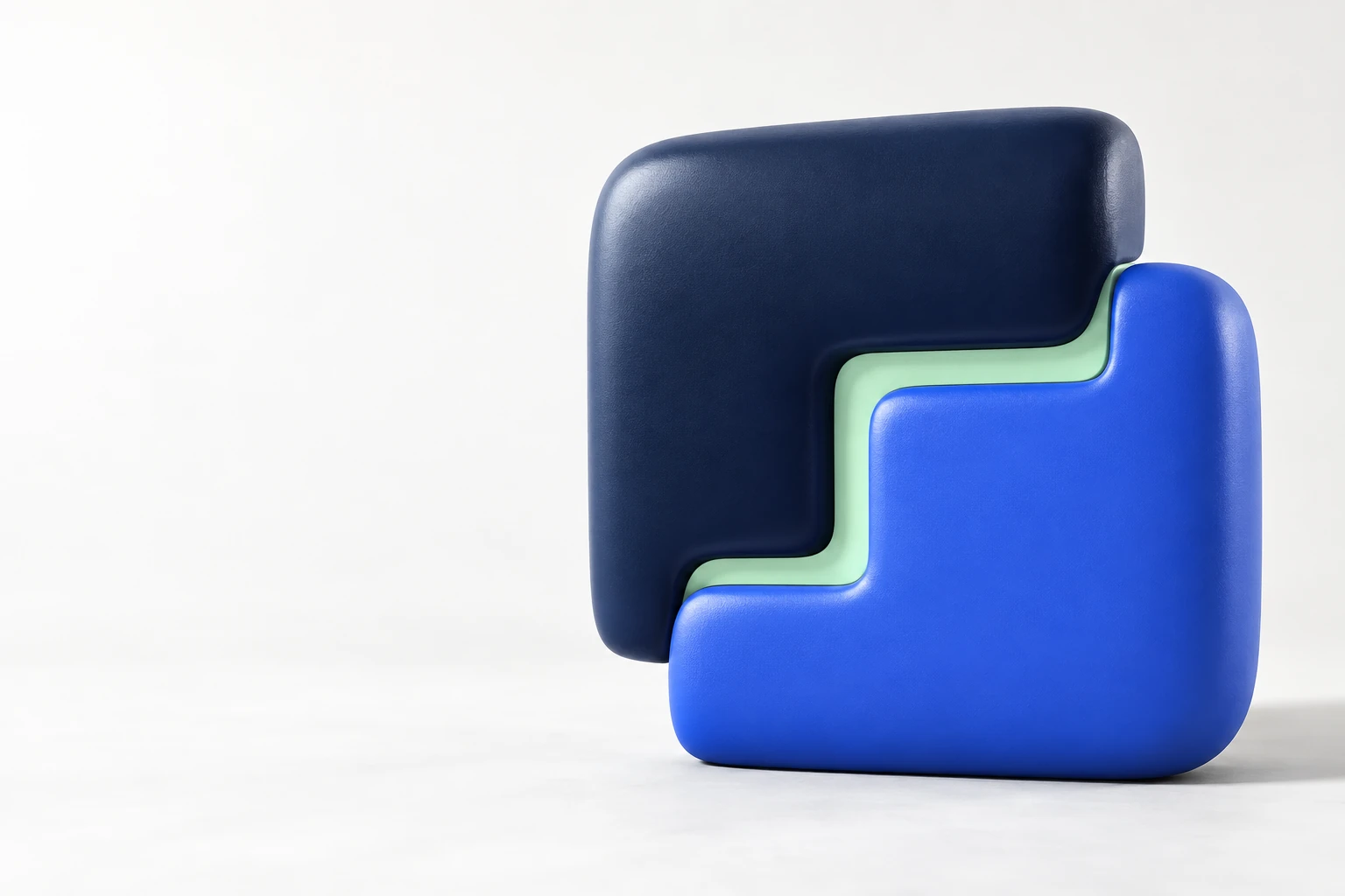
Two substantial, asymmetric forms fit together around one open, stepped seam. Each part has a shape of its own. Together, they make a clear whole—a simple expression of work that adapts and connects.
Keep at least one quarter of the visible symbol’s width clear on every side. More space is welcome.
For the standalone symbol, keep the visible mark at least 20px high. Use a 100px minimum for the full lockup.
Use the supplied vector paths. Never stretch, rotate, outline, add shadows, or retype the wordmark.
Ralti in a sentence. ralti in the logo.
Pronounced RAL-tee. Never an acronym.
 Compact, recognisable,
White gives the work room. Midnight brings focus. Cobalt points to the next move.
Mint adds warmth and signals a positive step. Cloud surfaces make complex work easier to read. Keep the canvas calm and reserve strong color for the things that matter.
Supporting neutrals
Cloud #F4F7FC · Slate #5C6780
Start with restraint
65% white & cloud · 20% midnight · 10% cobalt · 5% mint
White on cobalt: 5.75:1. Midnight on white: 15.57:1. Midnight on mint: 12.38:1. Use white text on cobalt and midnight text on mint. Never use white text on mint.
Inter Tight for the big idea.
Inter for everything that follows.
Strong, compact headlines meet readable, open body copy. Keep the hierarchy obvious and the spacing generous. Both families are licensed under the SIL Open Font License.
Big plans.
Find your fit.
Start with a thought. Give it some structure.
Make the next move.
Aa Bb Cc Dd Ee Ff Gg
0123456789 & @ → ↗
Distinct pieces. A shared purpose.
One connected whole.
Clear enough to trust.
Warm enough to work with.
Lead with what a person can do. Choose concrete verbs. Put the useful result before the technology. Let the work prove the promise.
Simple language. A clear next step.
Room for the person’s own idea.
Vague claims. Inflated language.
No useful picture of the product.
“Review 4 new columns before adding them.” Useful details build confidence.
“Added Publish date. Undo.” State the change and the next available action.
Demonstrate real capabilities. Use examples, never invented customer proof or performance claims.
A recognisable rhythm,
wherever we show up.
Start with a clear hierarchy. Show real work. Keep the next action obvious. The system should carry from a 16px icon to a full-screen campaign.
Use a 4px base grid. Create clear groups with 16–32px internal spacing and 64–112px section spacing. Avoid filling every gap.
Show actual workflows and related records. Campaign images use substantial, fitted forms in the core palette. The seam and relationship carry the story; avoid generic AI symbols.
Use 160–280ms for useful state changes. Let the two pieces come together once. Provide pause controls for continuing motion, and respect reduced-motion preferences. Keep all content readable and reachable.
Meet WCAG AA contrast for ordinary text. Use clear focus states, semantic controls, and labels as well as color. Plan for keyboard and small screens.
The complete identity, ready to use.